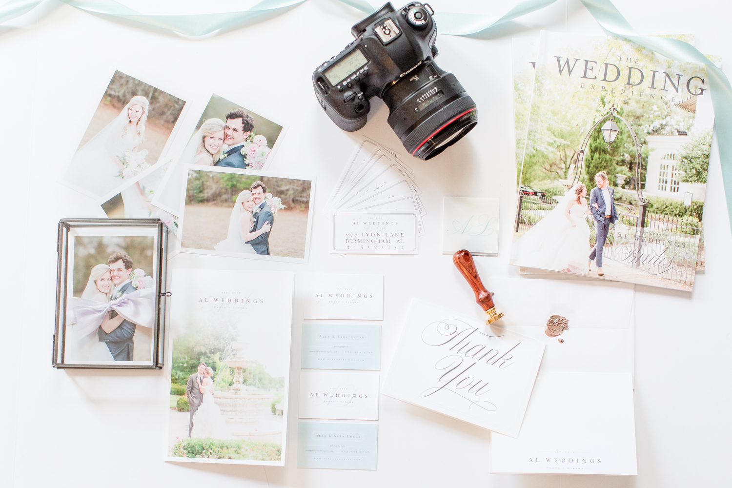
As you may have noticed, AL Weddings has gotten a whole new face lift!!! Our rebrand is something that we started back in September, and at the beginning of this year, we launched our new identity.
When we started AL Weddings back in 2013. Sara sketched the first logo in a notebook that I still have to this day, and then I designed our brand around that drawing. My background is in Graphic Design, so that was a fun thing for me to tackle back then. That would be the brand that we would use for the next three years!!! Who knew. Most new businesses don’t keep their first brand that long but we loved everything about it. We put so much work into our old website and logo that it became personal to keep the brand. But mid last year we started to itch for a new look. Nothing too major but just a little “clean up.” As we started thinking of what we wanted to change and update, we realized that we both wanted something much more than a little touch-up. WE WANTED ALL NEW!!!
This time I knew that I wanted to enlist the help of someone who knew what they were doing. We did some research and found Katie Roden of Linen & Leaf in Huntsville, Alabama. Now she primarily does custom wedding invitation design, but we loved her work and personality and knew she would make a great new look for our company. Boy did she over deliver on that.
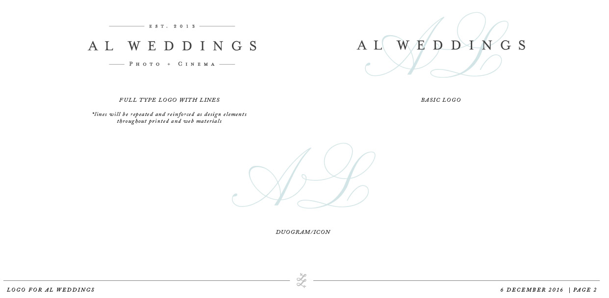
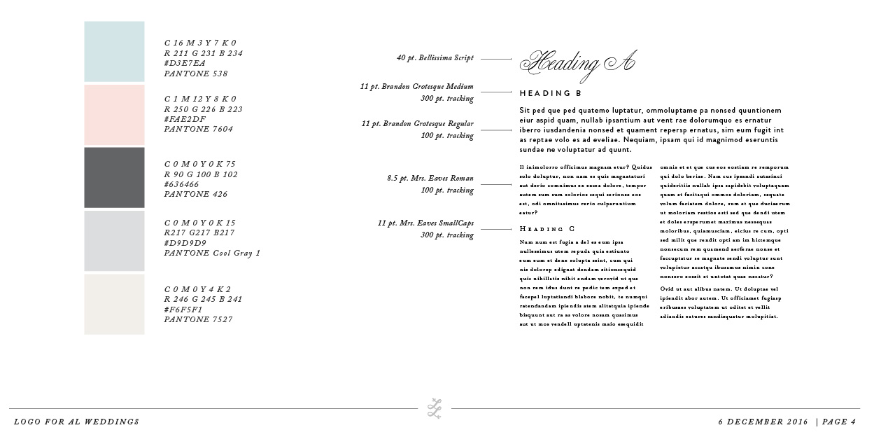
Some key things that we wanted out of our rebrand were something more elegant, a color slight color change, branding fonts, a logo icon, and a whole brand feeling of something more…. ADULT. We wanted a brand that we could take with us as we get a little older and our business matures. AKA, we didn’t want to rebrand again in 2 years. We want something that will last into our 30’s. Our old brand was nice, but it didn’t scream “Adult.” So we had to fix that. Well, Katie had to =)
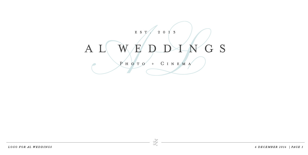 So with a Pinterest board full of inspiration, we nervously sent Linen & Leaf our ideas and hoped that she could come up with brand and ascetic we wanted. As much as I loved letting a pro do this, it was the first time I’ve ever had someone design something for me. I thought, “Hey, I know how to do this! No need to pay someone else to do it!”
Boy was I wrong when we met up at our favorite lunch spot, Urban Cookhouse, for the reveal of our new logo. I might have even choked on my Urban Cowboy sandwich when she showed us the designs! It was EXACTLY what I had in my head!!!
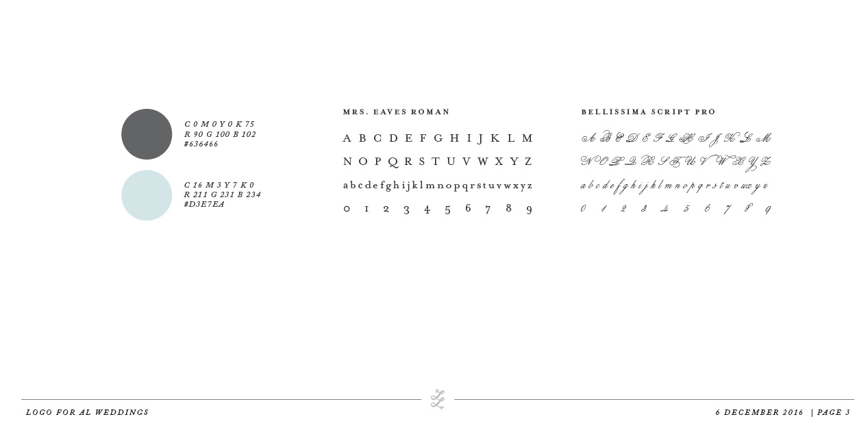
Now that we got our new logo it was time for me to work on the website. At this point, I still thought that we were going to just revamp the website. Ya know – update the logo, change some colors add new photos… you get the idea. Well, same with the logo, after getting some inspiration together I realized that a redesign was going to be in order. I still decided that I would be the one to design the website because honestly, I wasn’t 100% sure what we needed or wanted. So I just designed as I went. Not the best idea to design blind because it takes WAY longer. This website almost killed me. Ok, I exaggerate! But I don’t know that I’ve ever spent more time designing something. I’m pretty stoked how it turned out.
Now here we are! Whole new logo, whole new brand, new website and a whole new client experience ready to rock 2017.
